

Mastering Web Design Color Theory
Color isn’t just a visual treat; it’s a language that speaks to the human mind’s emotions, memories, and impulses. Since first impressions online are solely aesthetic, making color a significant component of web design. For web designers, entrepreneurs, and digital marketers, understanding and harnessing the power of color is not just a creative endeavor but a strategic imperative that can elevate user experience, enhance brand perception, and drive conversions.
This guide plunges into the vibrant waters of web design color theory. We’ll explore the psychological nuances of different hues, the art of color harmony, and practical applications of colors in web design. Whether you’re revamping your current website or building a brand new one, this in-depth expedition will set you on the path to a chromatic masterpiece.
Introduction to the Importance of Web Design Color Theory
When a user lands on a website, color is often the first element that captures their attention. The color scheme of a site can convey a sense of professionalism, playfulness, security, or urgency, often in just a glance. Understanding the role of color in web design is about recognizing its power not only as a visual aid but also as a strategic tool that can communicate a website’s purpose and personality. In this chapter, we’ll set the stage by exploring the inherent value of color in the online world.
The Visual Gateway to Your Brand’s Soul
A website’s color scheme resembles the attire one chooses for an important event. The colors you select reflect the occasion’s mood and your personality and can even influence the impressions of others. For brands, using color creates a recognizable visual identity that can be as iconic as a logo.
Directing User Attention
Efficient use of color will guide users through your website, signaling which elements are interactive, informative, or the focus of your content. Color helps form hierarchies on your page, allowing for a seamless flow of information that the mind can effortlessly process.
Creating Emotional Connections
Colors have the ability to draw out emotions and memories without uttering a single word. Understanding this emotional pull enables web designers to create a user experience that resonates beyond the screen.

What is Web Design Color Theory?
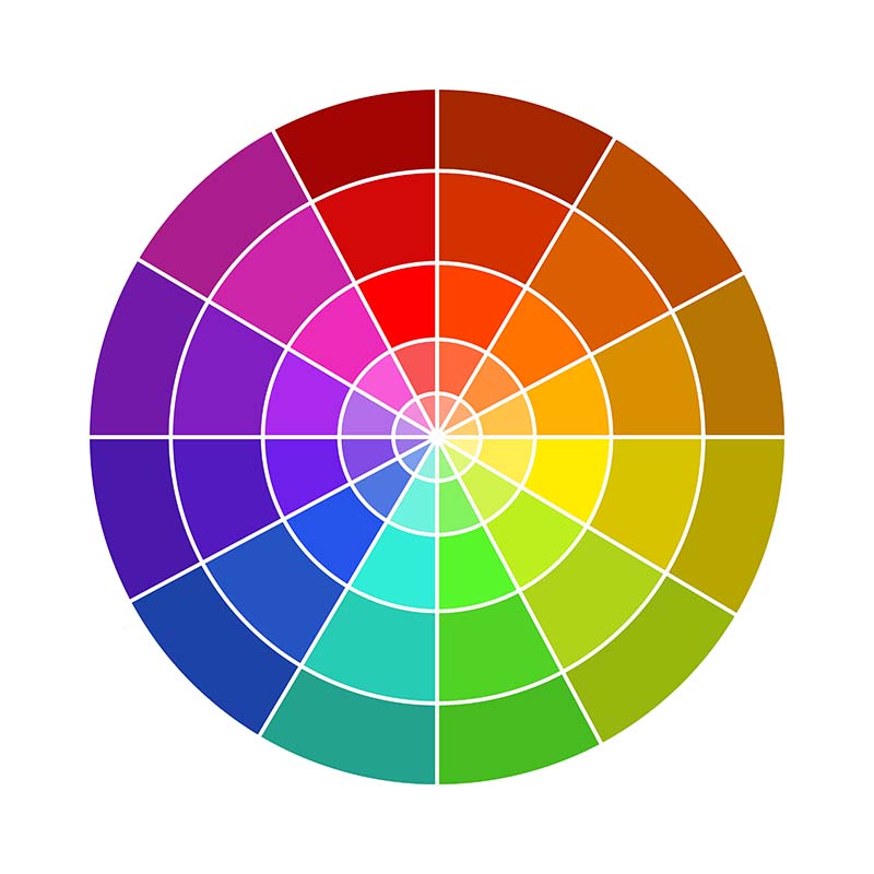
Before artists blend colors on their canvas, they understand color theory. It’s the foundation of any visual composition, and in web design, it’s the blueprint for creating balanced and effective color schemes. In this segment, we’ll break down the essential components of web design color theory and unveil the elements that make color come alive on the digital canvas.
What is Web Design Color Theory?
Before artists blend colors on their canvas, they understand color theory. It’s the foundation of any visual composition, and in web design, it’s the blueprint for creating balanced and effective color schemes. In this segment, we’ll break down the essential components of web design color theory and unveil the elements that make color come alive on the digital canvas.
How Color Influences User Experience and Perception
Your website’s color palette can make or break the user experience. A cohesive and thoughtful application of color can guide users where you want them to go, prompt the feelings you want them to have, and create an overall perception of your brand. We’ll investigate the various touchpoints where color directly influences how users interact with your website.
Creating an Inviting First Impression
First impressions are formed within milliseconds of viewing a webpage, and color significantly contributes to that impression. Discover how to use color to make users feel welcome and interested in exploring more of your content.
Navigating the Visual Landscape
Color can significantly impact your website’s usability. Learn how to choose colors that make button states, navigation bars, and links intuitive, allowing visitors to move easily through your site.
Sleight of Hand with Color and Conversions
The strategic use of color extends to your site’s call-to-action buttons and other conversion points. By selecting the right color, you can steer users toward your desired action, whether completing a purchase, signing up for a newsletter, or downloading a resource.
How to Apply Color Theory in Web Design
It’s one thing to understand color theory; it’s another to apply it effectively. The harmony of colors must not only be aesthetically pleasing but also functional and intentional. In this chapter, we’ll explore the practical applications of color theory in web design and provide you with actionable guidelines to apply.
Tools and Resources for Choosing the Right Colors
There are an array of tools and resources to aid your color selection process. From color palette generators to contrast checkers, these utilities make the intricacies of color theory accessible to all. Here, we’ll review some of the most popular tools and demonstrate how they can streamline your color decision-making.
- 1Color Palettes Generators: These handy tools can help you generate a range of color palettes based on different color relationships. They often suggest complementary, analogous, or monochromatic palettes, taking the guesswork out of which colors work well together.
- 2The Psychology of Your Color Choices: Some tools go beyond mere aesthetics, offering insights into the psychological impact of specific colors. By understanding the subliminal messages your color choices convey, you can align them more deliberately with your brand’s goals.
- 3Contrast Checkers: High contrast is essential for readability, especially for users with visual impairments. Contrast checkers evaluate the legibility of your text against its background, informing color selections that enhance, rather than hinder, user experience.
- 4Heatmaps and A/B Testing: Heatmap tools can show you where users are clicking and what sections of your website are getting the most attention. This data, combined with A/B testing of different color combinations, can empower you to make informed decisions about color placement and hierarchy.

Emphasizing the Role of Color in Effective Web Design
Color is a universal language that speaks volumes. It’s not just the icing on the cake; it’s the flavor that can define your brand, engage your audience, and catalyze your online success. By mastering the principles of color theory and applying them thoughtfully, you can magnify the impact of your website.
Ready to transform your website? Our Allegiant Digital web design experts are here to guide you through every shade of possibility. Schedule a consultation today and discover how the right color palette can elevate your brand, engage your audience, and amplify your online success.